INOSAGO
A car-insurance (OSAGO) service for an insurance agency: one system for customers on the website and for the people who sell policies — employees, agents, sales managers and admins. I designed every role and built the front end.
overview
- role
- Product designer & front-end developer
- client
- Insurance agency (NDA)
- period
- Sep — Oct 2026
- parts
- Customer site, agent workspace, manager and admin consoles
- stack
- Next.js 16, React 19, Tailwind 4, a fork of HeroUI
Buying OSAGO online usually feels like a quest: a seven-step wizard, captchas and chat pop-ups between steps, a callback to confirm data you have already typed, and a price from one insurer only. The people selling policies had it no better: every insurer has its own back office, the same client data was retyped for each, and insurers answer with technical codes.
INOSAGO puts both sides into one system. Customers get one form instead of a wizard and the prices of all connected insurers in a single calculation. Employees and agents get a denser workspace built on the same logic; managers and admins get plans, sales, roles, logs and integrations.
I designed every screen at 1440 and 390 and built the front end in six weeks: 54 pages, 174 components, 698 commits.
screens
context
Two sides fill in the same policy, and both struggled. Customers lost half their input on every step back and compared prices by filling the same form in several tabs. Employees issue dozens of policies a day across insurers that each have their own back office, rules for companies, owners and policyholders, and payment terms.
While an insurer was thinking, the screen stayed silent. In the client’s words: “right now the screens show no activity and look frozen.”
role
Everything on the front: product design for all four roles, the design system and the front end itself. I took HeroUI and fitted it to the prototype; color and type tokens are shared between Figma and code, so the mock-up and the product speak the same language. The back end was built by another team.
one form
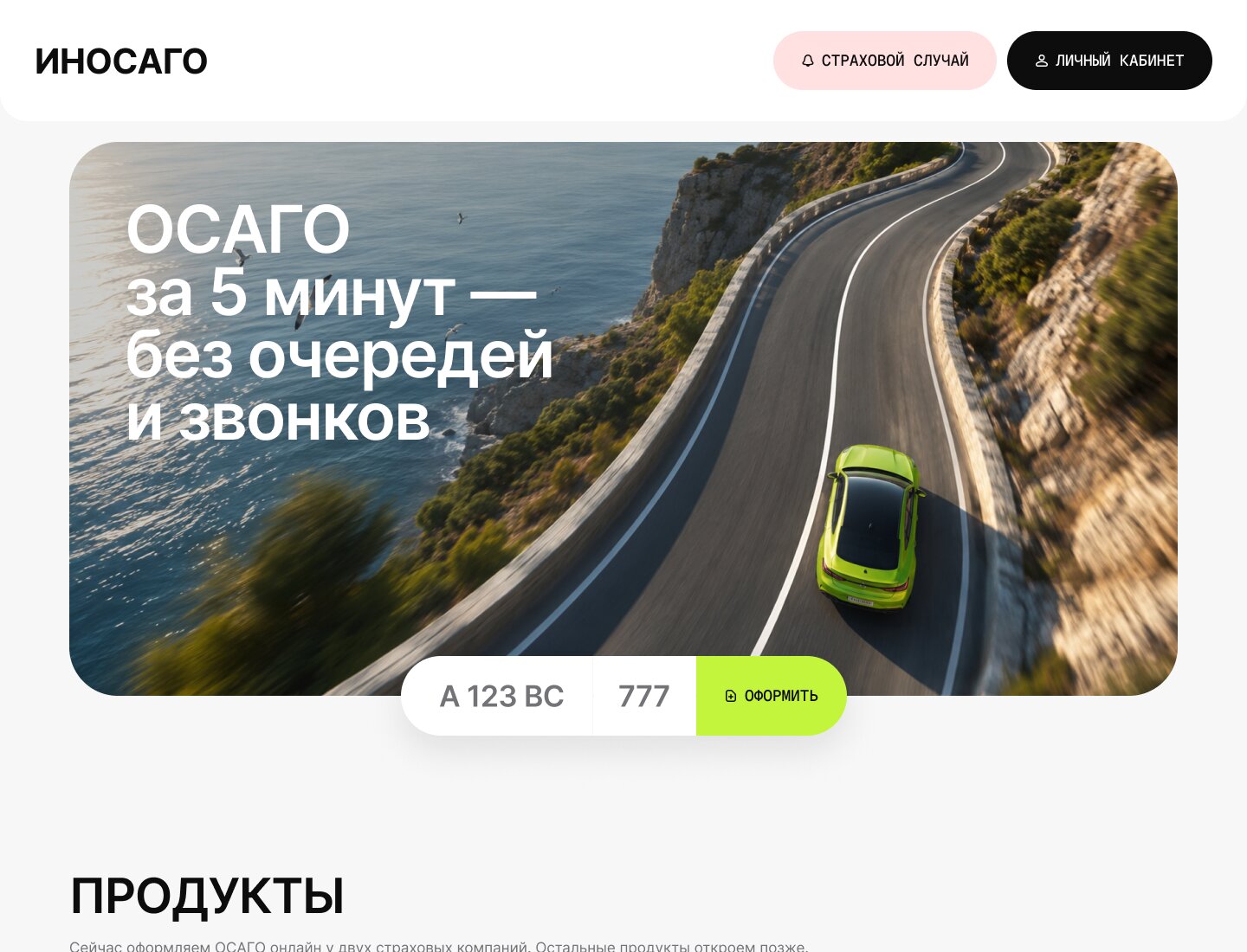
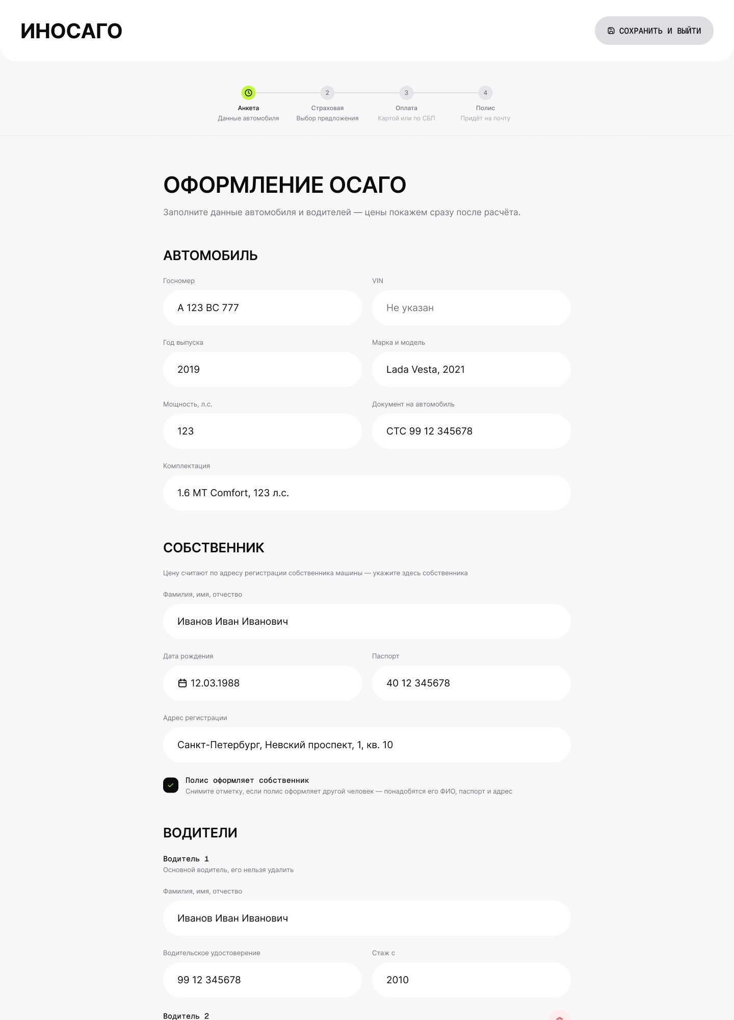
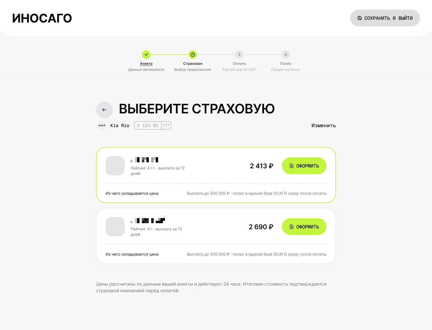
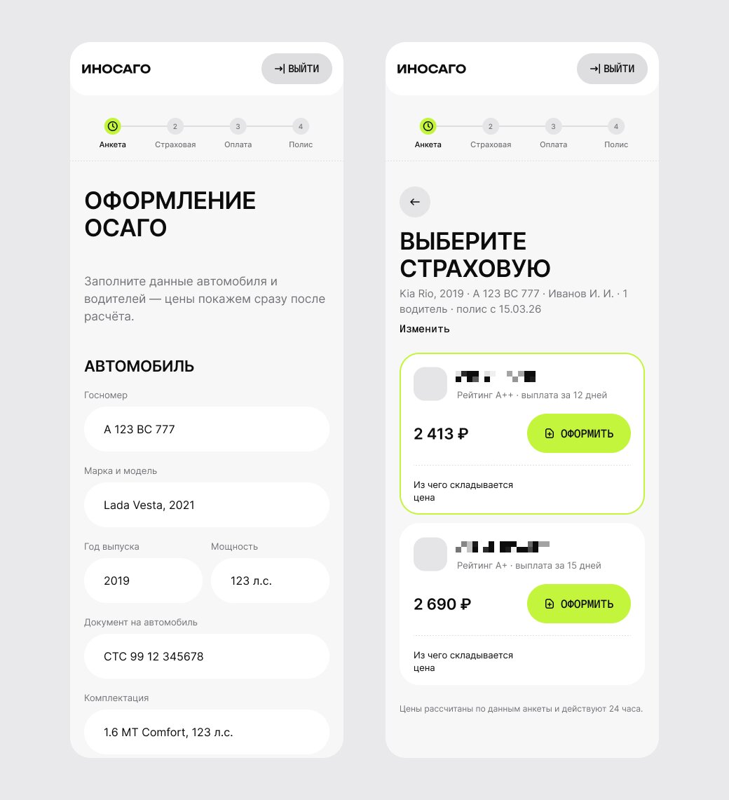
The first screen asks for one thing — the plate number; products and the explanation come further down, with no forms or modals at the entrance. The form is four blocks on one screen: car, owner, drivers, period. A “the owner is the policyholder” checkbox removes the second round of typing.
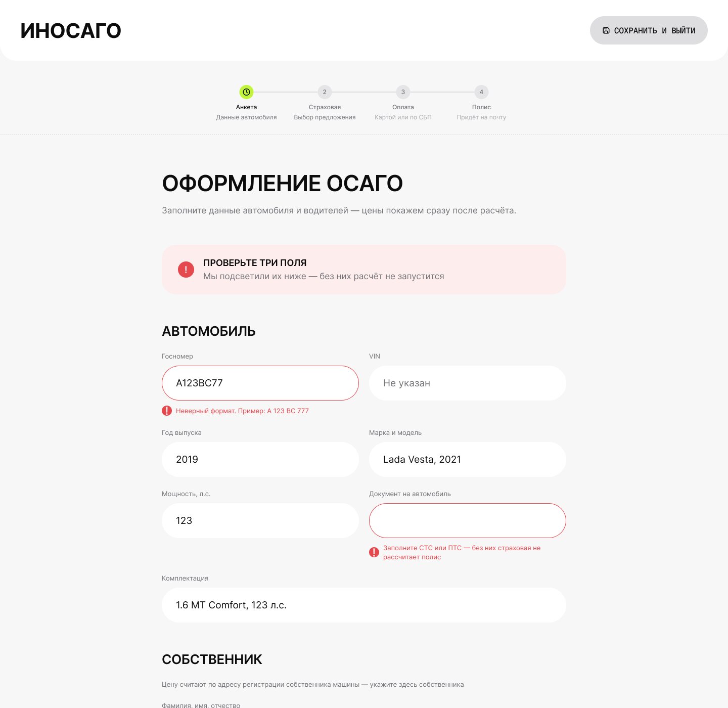
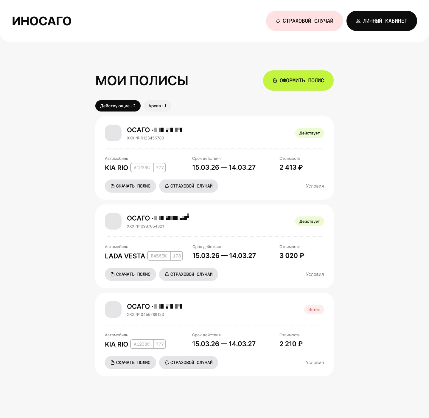
An error shows at its field before submitting, and a summary on top says which fields to fix and why. The product carries on after payment: an account with policies, renewal in two actions and a step-by-step guide for an accident.
price first
Prices from every insurer arrive in one calculation and sit on one screen; “what the price is made of” opens in place. Tags next to a price — pool, cross-sale required — show the specifics of a contract before choosing, not at payment.
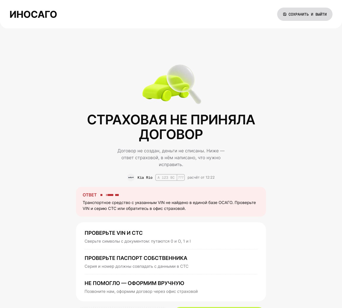
If an insurer declines, its row says why in plain words, next to the insurer’s verbatim answer and a request tag, so the agent knows what to fix and support can find the request in the exchange log.
when it fails
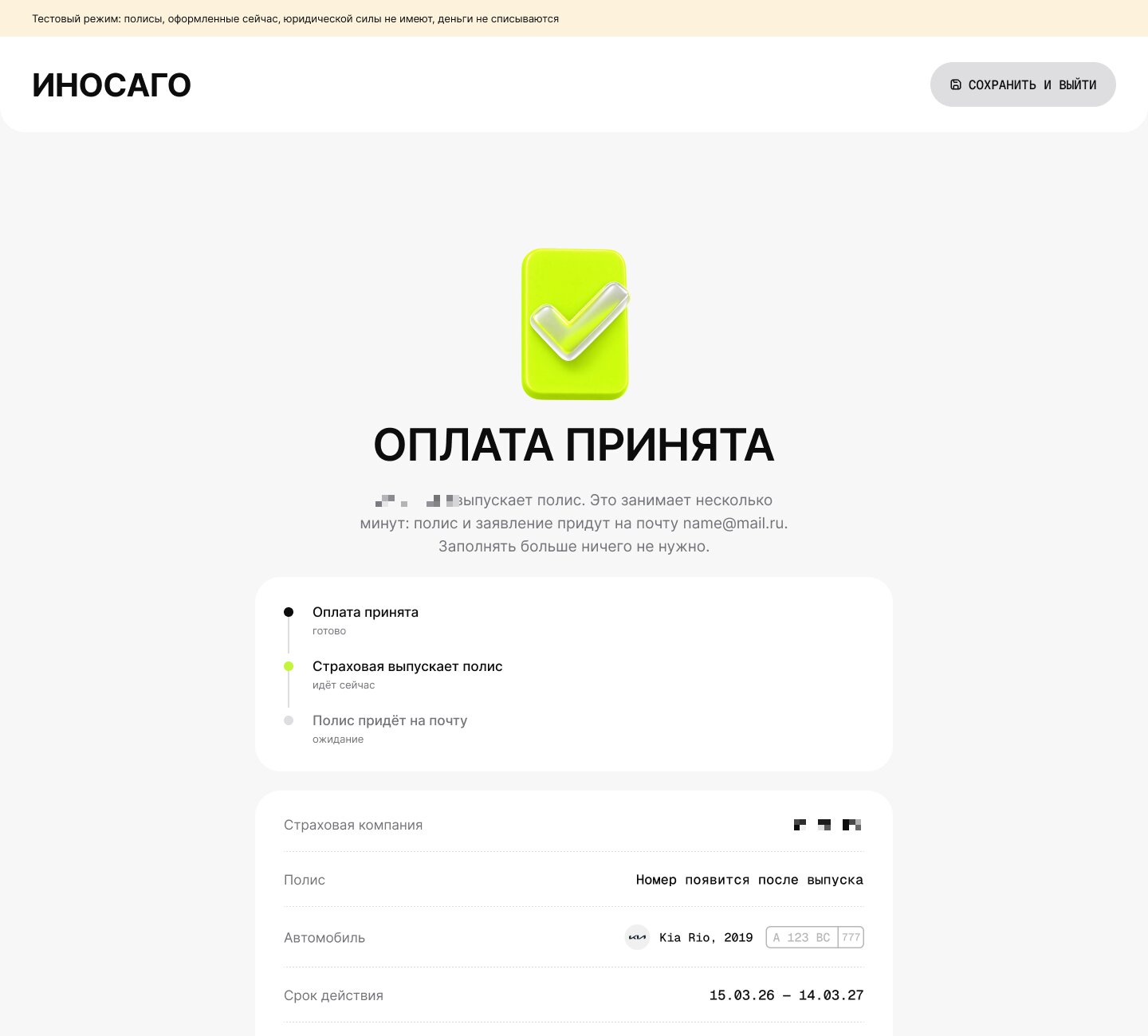
Every failure has its own screen — the insurer declined the contract, nobody returned a price, the contract is still being issued, the calculation expired — each with the cause, hints and the next step. There is no “something went wrong” anywhere in the product.
Waiting is a screen of its own: a draining bar and a timer that says the insurer usually answers within two minutes. If it takes longer, the screen says so honestly and refreshes by itself.
workspace
“New policy” follows the customer form but denser: the owner comes from the client base, the car from its card, the total is pinned on the right and the draft saves itself. “My day” shows what needs action now — awaiting payment, refusals, urgent renewals — and the unfinished calculations below.
The client card gathers cars with documents, drivers, calculations and policies. Phone and passport show only their last digits; full data opens through “Edit data”, and that goes into the log. Companies fill in by tax ID from the state register.
Managers see plan completion, sales by agent and people with no sales, grant payment methods and move people between roles. Admins manage users, roles and departments, see the action log, external requests with their cost and insurer keys with a check, and export the exchange log as a file ready to send to an insurer.
mobile & access
Every screen is drawn at both 1440 and 390. On a phone tables turn into cards; on desktop wide tables keep their first and last columns pinned.
A low-vision mode enlarges text by 15 or 30% and switches the site to monochrome. Fields and buttons are labelled for screen readers, focus is always visible, statuses are announced through live regions and motion follows the reduced-motion setting.
style
Monochrome, one accent, one type family. A grey scale from white to near-black, a lime accent for the main action and the selected state, and one red only for errors and refusals. Headings are set wide and in capitals, text and fields in a grotesque, and buttons, labels, sums and timers in mono so the digits never jump.
Fields and buttons are 68 px pills; white cards with 28–32 px corners lie on light grey and split their rows with dashed lines instead of borders. Buttons are verbs — “Issue policy”, “Edit data” — and every error names its cause and the action.
process
The mock-up was the source of truth: coded screens were wired to the back end without changing how they look. Every change to copy or state was agreed with the client as a “was → becomes” list before it was written, and the client’s decisions live in the code next to where they apply, with the date and the Linear task.
After launch I checked Figma against the working product and updated it for every role on desktop and phone, so the mock-up matches what users see again.
numbers
One form instead of a seven-step wizard; three insurers in one calculation; 76 + 76 screens and 38 + 39 dialogs on desktop and phone; 147 components and 12 variant sets in the Figma library; 54 pages and 174 components in the front end; 154 screen-reader labels, 39 live regions and 70 visible-focus styles — built in six weeks, 698 commits.
Business numbers — conversion, time to a policy, refusal rate — have not been measured yet. The system already collects them in analytics and the insurer exchange log.